

The Look of Radio
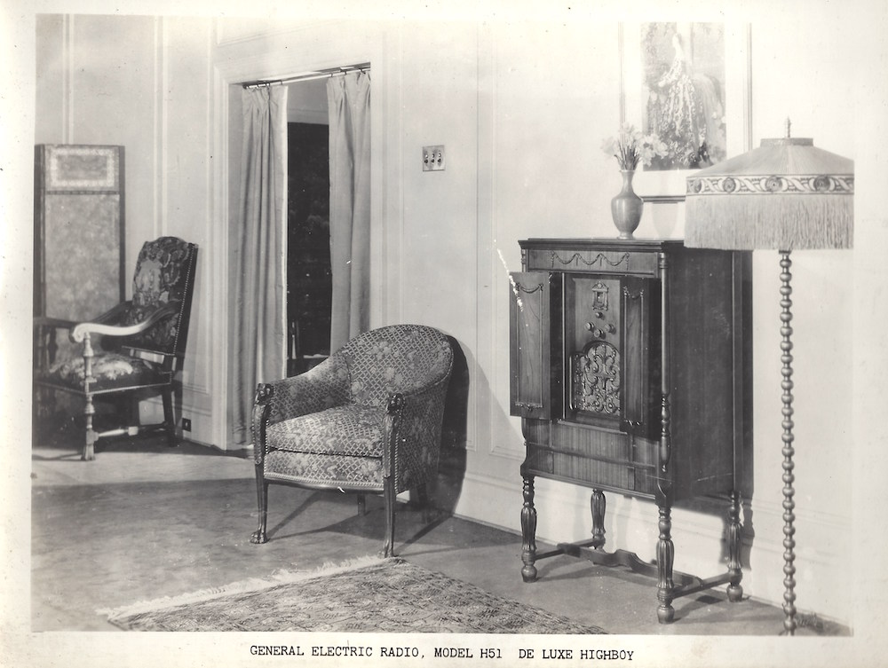
Model H51 de Luxe Highboy, Canadian General Electric, Toronto, Ontario. Musée des ondes Emile Berliner.
Radio’s popularity grew in the 1920s in part because of more on-air content. And companies produced more reliable and easier-to-use receivers. As they entered living rooms or parlours, radio receivers became objects of visual, as much as auditory, interest. Manufacturers designed console sets in popular historical furniture styles. Queen Anne or Chippendale sold well. These styles matched the tastes of middle and upper-class homeowners.
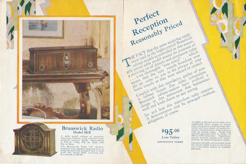
“Perfect Reception: Reasonably Priced,” A Beautiful Table Model: Brunswick Radio (1929). Musée des ondes Emile Berliner.
Advertisements presented radio as thoroughly modern. But radios looked like existing furniture and came in familiar styles. Modern graphics signaled the excitement of the new, electronic medium that could bring about instant communication. Zig-zag lines and abstract decoration of the kind seen in French-inspired “moderne” graphic design brought otherwise commonplace receivers to life.
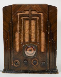
RCA Victor: Model Globetrotter P6-1 (1935), Montréal, Québec, 48 x 40 x 27cm. Musée des ondes Emile Berliner.
By the mid-1930s, radio receivers themselves helped bring modern design into Canadian homes. Smaller, tabletop models were the first to witness modern styling. The front of the RCA Victor “Globetrotter” P6-1 presents the common Art Deco motif of a “frozen fountain.” This motif may have reminded users of the tapering skyscrapers that had begun to mark city skylines, like Montreal. It was in Montreal where RCA had its main factory that it produced this radio.
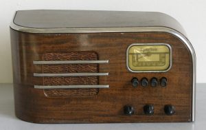
Sparton: Model 051 (c.1932), London, Ontario, 20 x 38 x 19cm. Musée des ondes Emile Berliner.
Other tabletop models represented the speed of radio communication through a streamlined design. The streamlined style became popular in the 1930s and brought curved forms to architecture, automobiles, and everyday products alike. The horizontal sweep of the metallic details around the edge and across the speaker of this wooden Sparton radio exemplifies this popular trend.
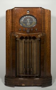
Marconi: Model 85 (c.1936), Montreal, Quebec, 109x 63x 36cm. Musée des ondes Emile Berliner.
The Marconi Model 85 indicates the gradual shift from period style cabinetry to modern appliance in larger floor models. Its speaker grill is fitted behind carved spindles. The spindles suggest the strings of a musical instrument or may reference the ornamental details of period furniture. These decorative details are paired with a large, oval radio dial that evokes speedometers of contemporary cars or planes. Above, a “magic eye” would glow, visually marking the arrival at a clear frequency of a station. Altogether, this radio receiver was well suited for a Canadian living room with traditional or modern furniture.
In contrast to the large wooden consoles, smaller tabletop radios offered designers opportunities to work in new materials. New materials included Bakelite and other early forms of plastic. The Crosley Model D-25 seen below offers a prime example. Its smooth and rounded surfaces perfectly suited the idea of speed associated with radio. Sounds could travel instantly from elsewhere on earth into the home. Both form and material helped represent the modernity of radio.
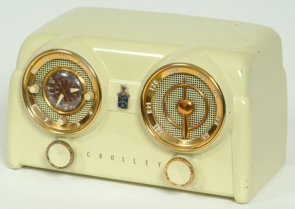
Crosley: Model D-25 (1940), Toronto, Ontario, 19 x 33 x 18.5cm. Musée des ondes Emile Berliner.
Radio receivers became colourful additions to living rooms, kitchens, and bedrooms. Designers experimented with forms and pigments. For example, Northern Electric’s line of “Baby Champ” radios promoted the diversity of colours available. In the postwar years, people continued to associate radio with modern design. Streamlining and the ornament of Art Deco gave way to more simplified, rectangular forms. For example, this is noticeable in the change of the design of the Baby Champ in the 1940s.
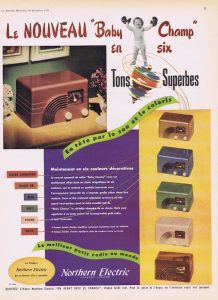
“Le Nouveau ‘Baby Champ’ en six Tons Superbe” (The New ‘Baby Champ’ in Six Stunning Tones), Le Samedi (December 1947). Advertisement. La Société Québécoise des Collectionneurs de Radios Anciens (SQCRA).
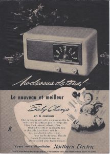
“Au-dessus de tous! Le nouveau et meilleur Baby Champ en 6 couleurs” (Above all! The new and better Baby Champ in 6 colors), Reader’s Digest (1948). Advertisement. Musée des ondes Emile Berliner.